

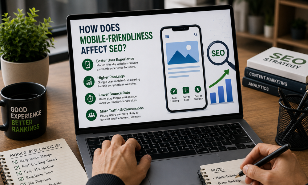
How Does Mobile-Friendliness Affect SEO?
People use their smartphones for almost everything online, from searching for information and comparing products to contacting businesses and making purchases. Because of this shift in user behaviour, having a mobile-friendly website is no longer optional. It has become an important part of a successful SEO strategy.
Mobile-friendliness and SEO are closely connected because search engines want to provide users with websites that are easy to access and use. If a website works well on smartphones and tablets, visitors are more likely to stay, explore different pages, and take action.
For businesses working on improving their online visibility, Vijay SEO considers mobile usability an important part of building a strong search presence.
What Is a Mobile-Friendly Website?
A mobile-friendly website is designed to work properly on smaller screens without requiring users to zoom in, scroll horizontally, or struggle with buttons and menus.
A good mobile website should have:
- Responsive design that adapts to different screen sizes
- Easy-to-read text
- Simple navigation
- Properly sized buttons and links
- Fast-loading pages
- Images that display correctly
- Forms that are easy to complete on a phone
The goal is simple: visitors should be able to use the website comfortably regardless of the device they choose.
Why Is Mobile-Friendliness Important for SEO?
Google focuses heavily on providing a positive experience for search users. Since most searches happen on mobile devices, websites need to perform well on smaller screens.
Google uses mobile-first indexing, which means the mobile version of a website is primarily used for crawling and indexing its content. If important content is missing or difficult to access on the mobile version, it can create SEO problems.
A mobile-friendly website also helps visitors interact with your content more easily. When users can quickly find what they need, they are less likely to leave the page immediately.
Mobile Experience Can Affect User Behaviour
Imagine someone searching for a service on their phone. They click a website, but the text is tiny, the menu is difficult to use, and the page takes too long to load. Most users will simply go back to Google and choose another result.
Poor mobile usability can therefore lead to fewer page views, fewer enquiries, and lost opportunities.
On the other hand, a clean mobile experience encourages visitors to spend more time exploring the website. This creates a better overall user experience and can support broader SEO performance.
Website Speed Matters on Mobile
Mobile users often browse while travelling or using mobile networks, so slow-loading pages can quickly become frustrating.
Large images, unnecessary scripts, excessive plugins, and poorly optimised website code can increase loading times. Improving these areas can make a website faster and more comfortable to use.
Some useful steps include:
- Compressing large images
- Using modern image formats where appropriate
- Reducing unnecessary scripts
- Improving server response time
- Removing unused website resources
- Keeping pages technically clean
A faster website benefits both users and search visibility.
Responsive Design and SEO
Responsive web design allows a website to automatically adjust its layout according to the user's screen size. Instead of maintaining separate desktop and mobile websites, businesses can provide one website that adapts across devices.
This approach makes website management easier and provides a more consistent experience. It also helps prevent problems caused by having different content or URLs for desktop and mobile visitors.
For SEO, consistency matters. The same important information, headings, links, and useful content should be accessible to users regardless of their device.
How to Make a Website More Mobile-Friendly
Improving mobile SEO does not always require a complete website redesign. Start by checking how the current website behaves on different screen sizes.
Make sure the navigation is simple and important information is easy to find. Use readable font sizes and provide enough space between clickable elements. Avoid layouts that force users to zoom or scroll sideways.
Images should also be optimised so they look good without unnecessarily increasing page size.
Businesses can regularly test their websites using Google's available mobile and performance resources and fix usability issues as they appear.
Mobile-Friendliness and Organic Traffic
A website's search performance depends on many factors, including content quality, relevance, technical SEO, authority, and user experience. Mobile-friendliness is one important part of this larger picture.
If a website provides a poor mobile experience, it can make it harder for users to engage with the content after finding it through search. A well-optimised mobile experience, meanwhile, creates a stronger foundation for attracting and converting organic visitors.
This is particularly important for local businesses because many people search for nearby services from their smartphones.
Mobile-friendliness has become a basic requirement for modern websites. A responsive design, fast loading speed, readable content, simple navigation, and accessible buttons can make a major difference to the user experience.
For businesses aiming to improve their SEO, mobile optimisation should not be treated as a separate task. It should be part of the overall website and SEO strategy. Vijay SEO can use mobile-focused optimisation alongside content and technical SEO practices to help businesses build a website that is easier for both users and search engines to access.
Frequently Asked Questions :
Yes. Mobile-friendliness is an important part of creating a good search and website experience, particularly because Google primarily uses the mobile version of websites for indexing.
Mobile-first indexing means Google primarily uses the mobile version of a website's content for crawling and indexing.
Use responsive design, optimise images, improve loading speed, make text readable, simplify navigation, and ensure buttons and forms are easy to use on smaller screens.
Website speed can affect user experience and is an important technical consideration for SEO. Faster pages generally provide a better experience, especially for mobile users.
Yes. Responsive design allows one website to adapt to different screen sizes, making content easier to maintain and providing a consistent experience across devices.